
Brand Identity & Commerce | Co-founder & Graphic Designer | 8 weeks
small batch hand-roasted
30 Story Coffee
Building a coffee brand around the way people actually choose our coffee.
30 Story Coffee is a small-batch roaster in Guelph, selling through local markets and e-commerce.
I co-founded it, and I designed all of it.
Scope: brand strategy, visual identity, packaging, UX/UI, e-commerce, art direction
Built with: Adobe Illustrator & Photoshop, WordPress, Elementor Pro, WooCommerce
Why the rebrand?
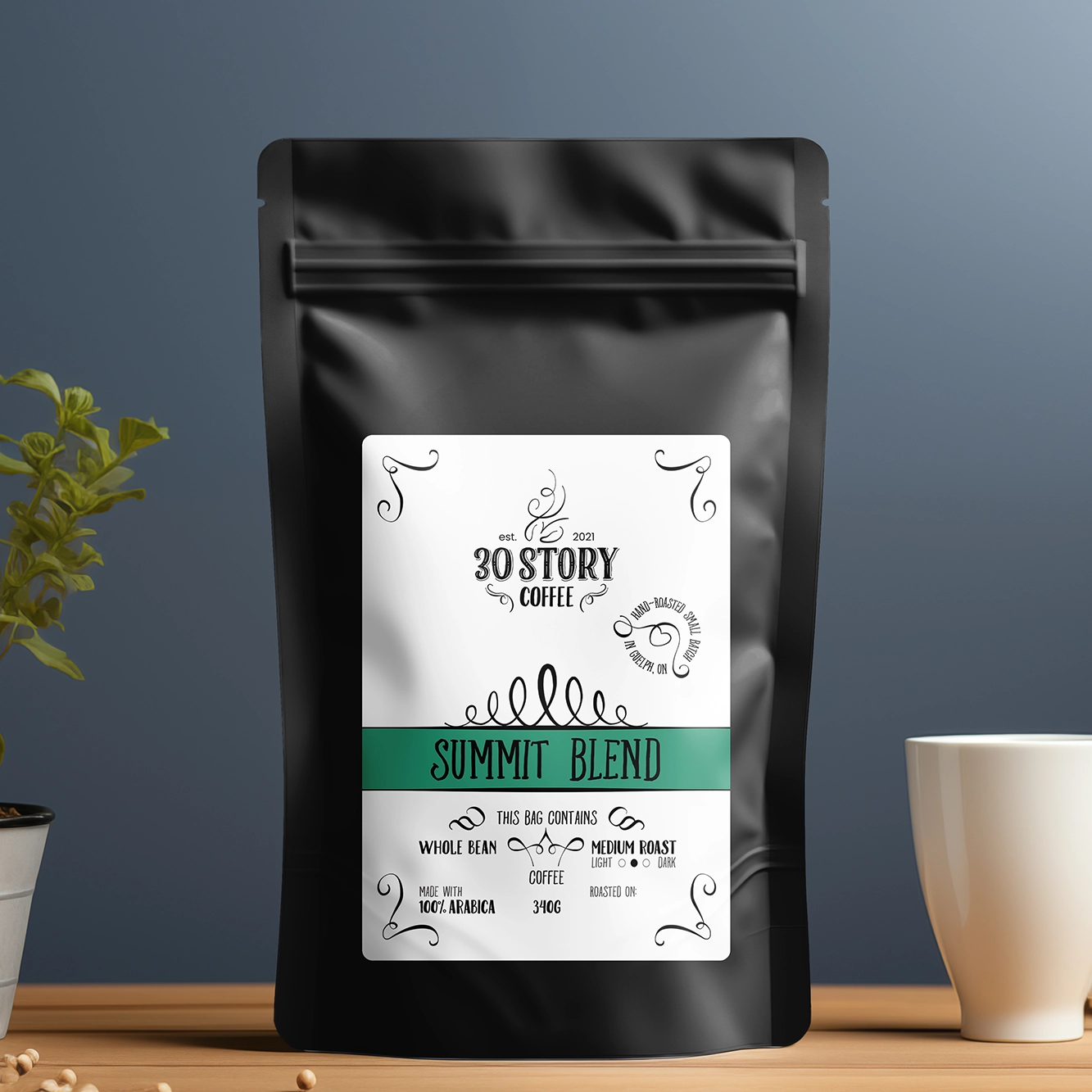
The first identity got us started.
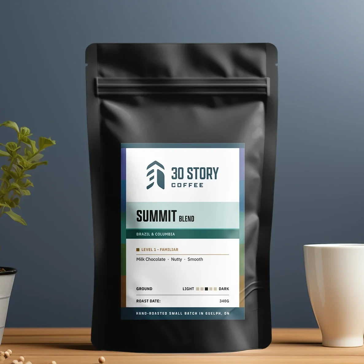
The second had to tell people who we were.
timeline
2020
Roasting starts as a pandemic hobby.
2021
First identity, first sales.
2023
First market season.
2023-2025
More market seasons and increasing repeat demand.
early 2026
Expanding lineup prompts a full brand reassessment.
June 2026
New 30 Story Coffee identity and level system launches.
In 2021, the design needed to function and be credible enough to put on the bag. It got us selling but there was no audience strategy, positioning work, or identity system.
5 years and 3 seasons of selling in person, the problem was a growing lineup of rotating coffees that customers had to compare for themselves. This prompted a reassessment of the brand and led to developing an identity that reflected what 30 Story Coffee had become. I rebuilt the brand around what we discovered it needed: a flexible identity and a product system that help people choose confidently.
The Challenges
Customer Uncertainty
Design a system to make choosing the right roast simple and friction-free, in person and online.
Rotating roasts
Create an adaptable labeling system that accommodates varying product information without looking temporary.
Small Budget
Balance the constraints of a small-budget production operation with room to grow.
the "market" research
3 seasons, same questions
“I usually drink Timmies. What would I like?”
“Do you have any dark roasts?”
“I’m buying for someone who likes to try different things.”
Confidence
Some people prioritize buying local, reliable quality. They’re not well-versed in specialty coffee, and they’re not looking to be.
Discovery
Some people are already buying specialty coffee, for themselves or others, and ask about origin and process, and are excited by unique flavours.
Both value quality, but they present unique buying behaviour so the brand needed to speak to the spectrum.
The coffee can be complex,
but choosing should be simple.
The Exploration & Iteration
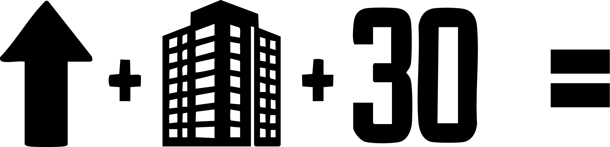
Early exploration focused on expressing elevation.
the brand
position
The customer insight aligned naturally with the reason 30 Story existed in the first place.
Your ritual, raised.
Rather than positioning around expertise, I built the brand around making an everyday experience more intentional (the common sentiment in both customer segments).
RITUAL: a repeated, meaningful part of the day, beyond caffeine.
CRAFT: tasting and calibration already used in both founders’ culinary background
EXPLORATION: curiosity without prerequisites
mark
The name comes from the 30th-floor condo where the roasting started.
The mark ties to the idea of elevation — raising our ordinary daily rituals.

Typefaces
Primary – Apotek – identity & display

Secondary – IBM Plex Sans – body

Colours
I leaned into a navy blue teal that behaves like a neutral base for the roast and Level colours. Colour belongs to the coffees, while the brand holds everything together without competing.
the level system
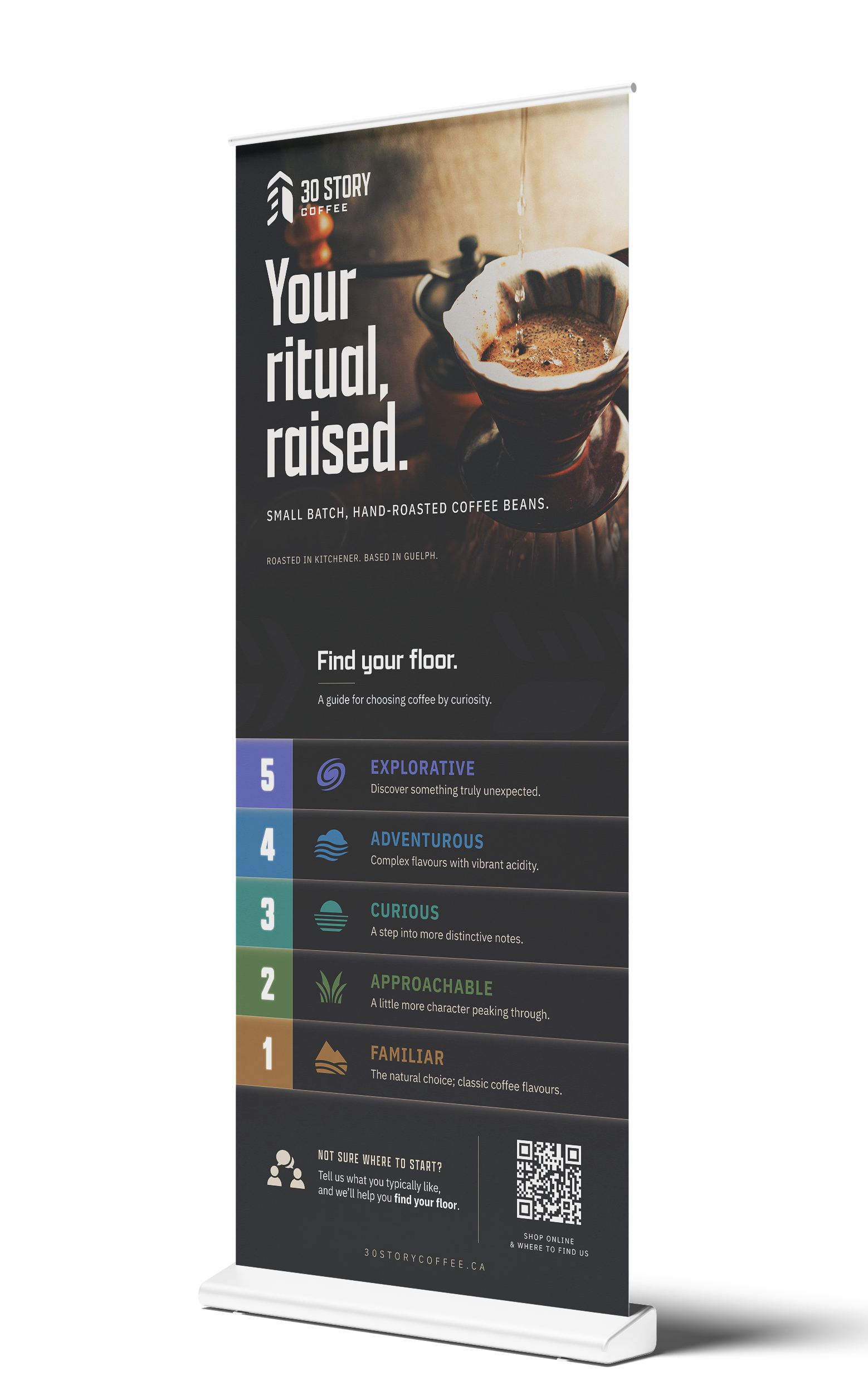
"What should I buy?"
A 5-step scale to recommend a roast without an in-person conversation, measuring familiarity, not quality.
Coloured from the ground to grass to horizon to sky to galaxy.
5
Explorative - The most unusual in the lineup.
4
Adventurous - Pronounced origin character.
3
Curious - Distinctive, for someone ready.
2
Approachable - More character, still familiar.
1
Familiar - Classic coffee flavours.
Real interaction:
One customer shopping for his father told us that his dad loved trying unusual coffees. Once we explained the system, he naturally gravitated toward our Level 4 and 5 roasts.
Reflection:
The system is still young, but as we grow further into e-commerce or even wholesale, success will mean customers learning to use the system independently.
one packaging system
accommodating a rotating lineup
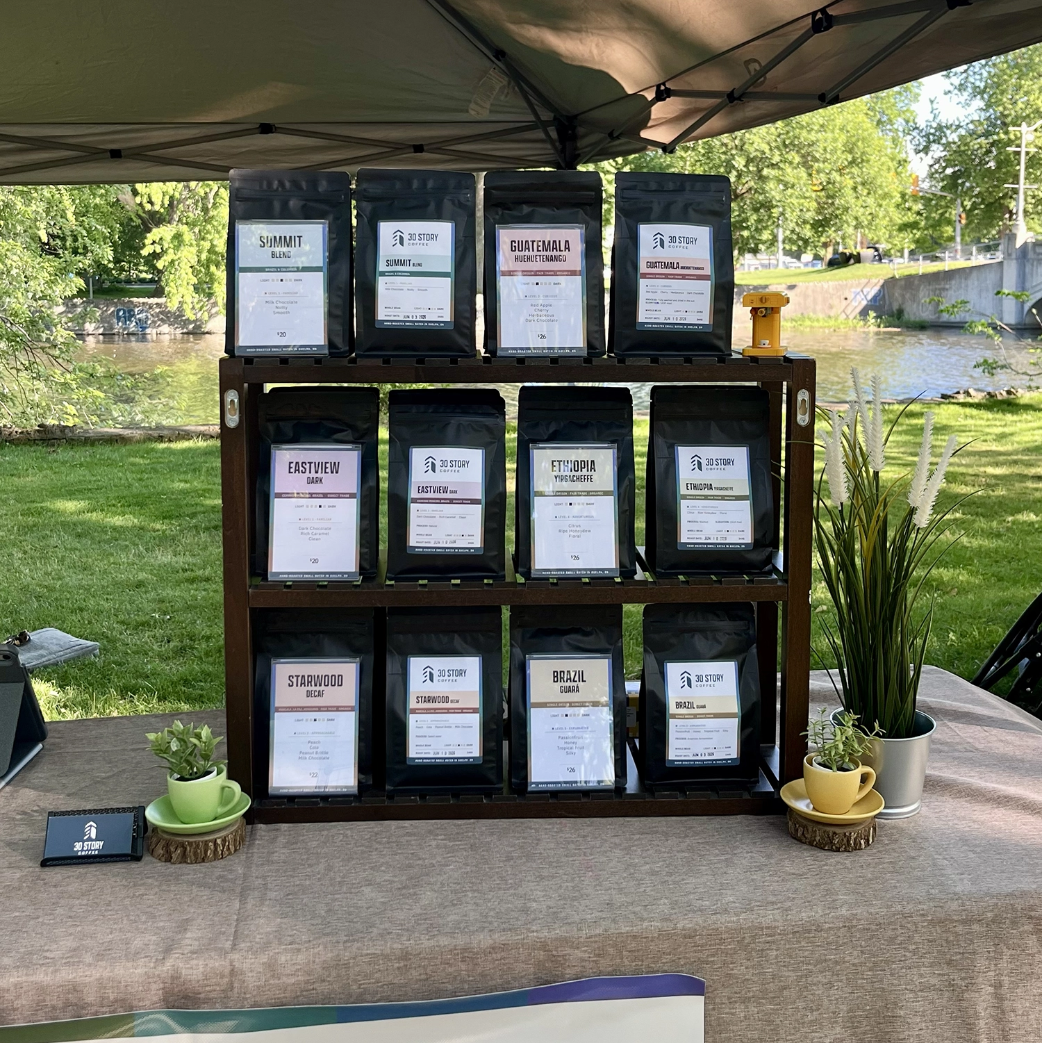
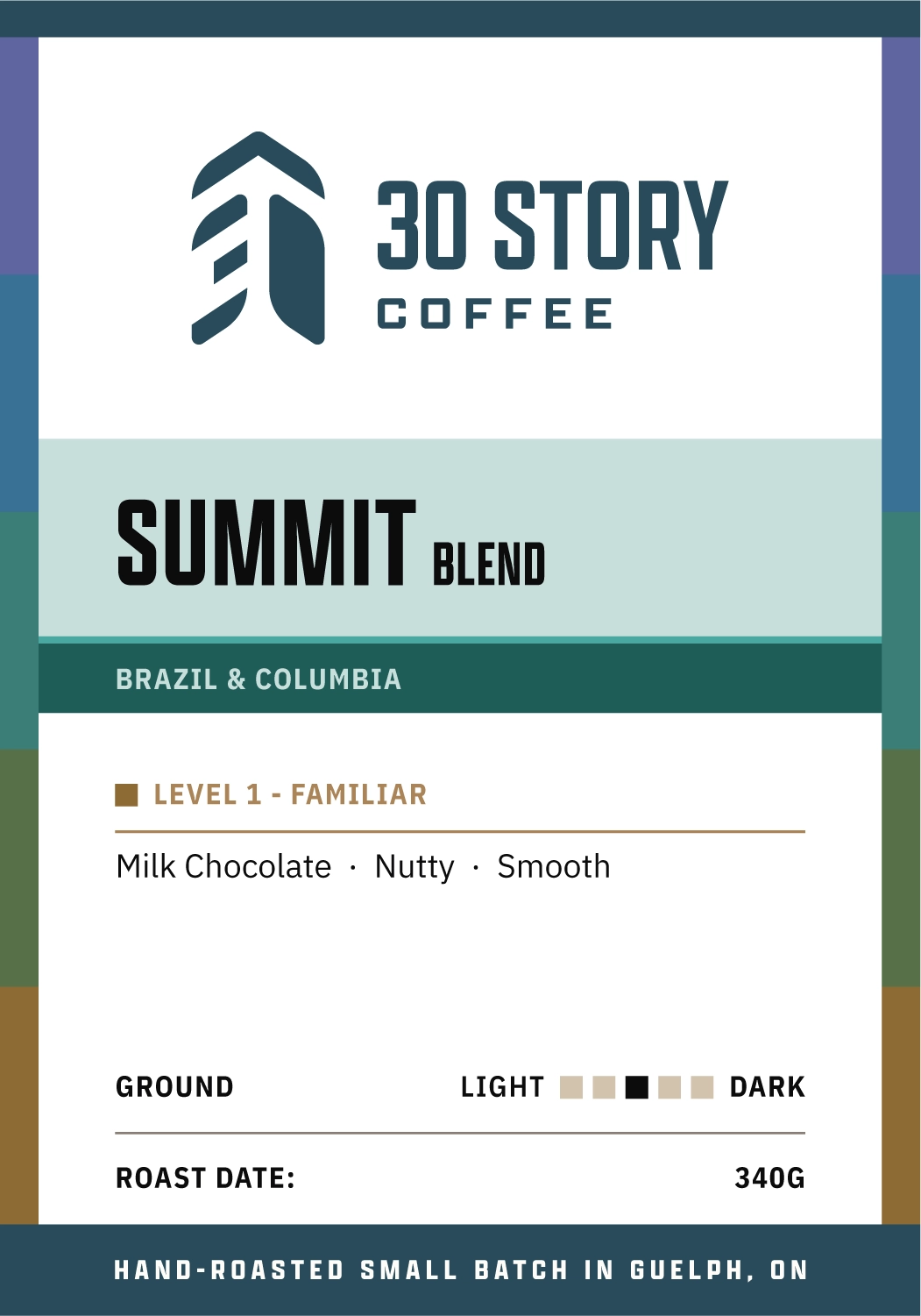
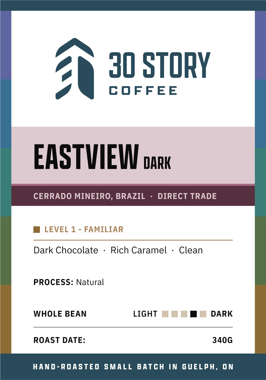
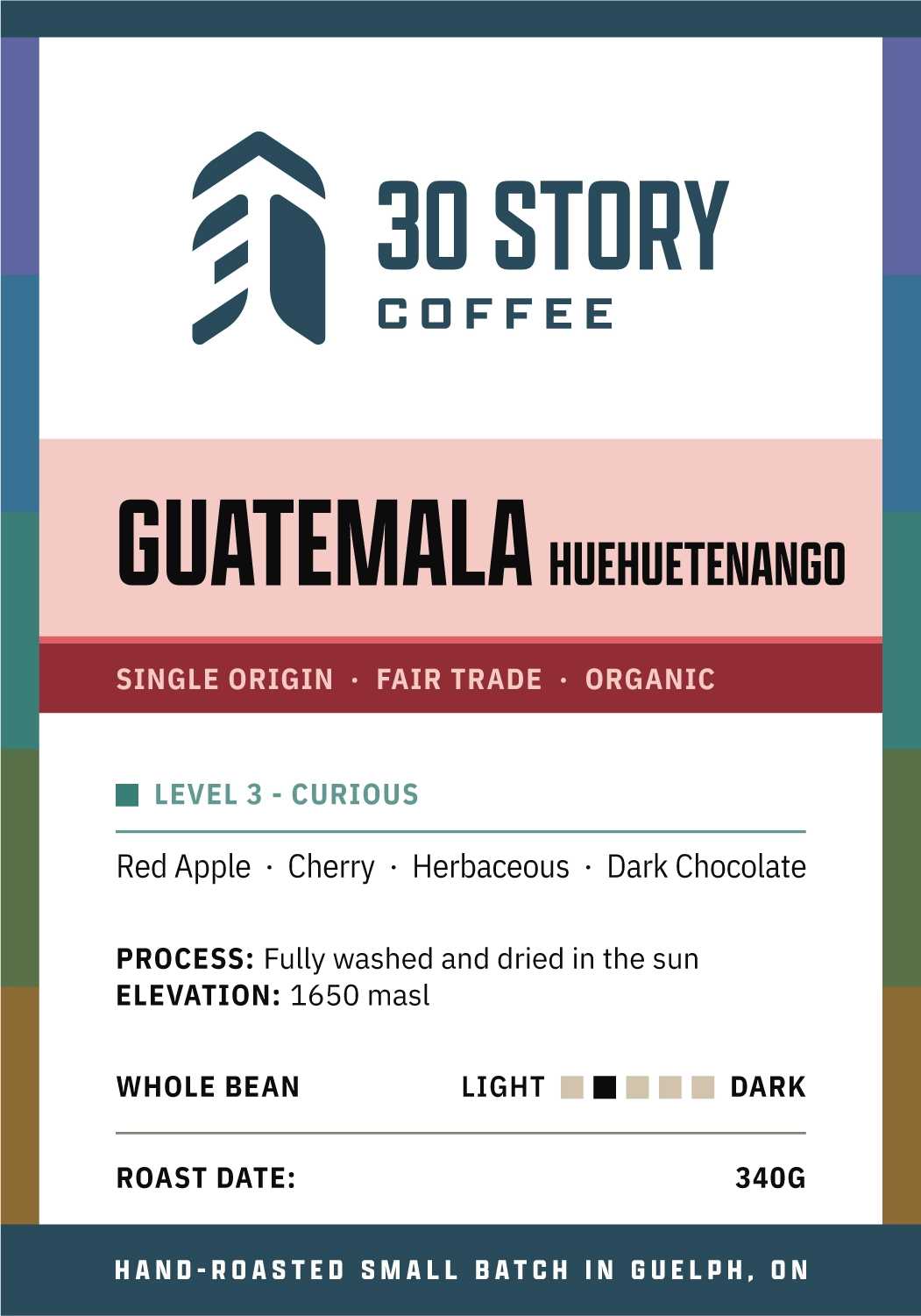
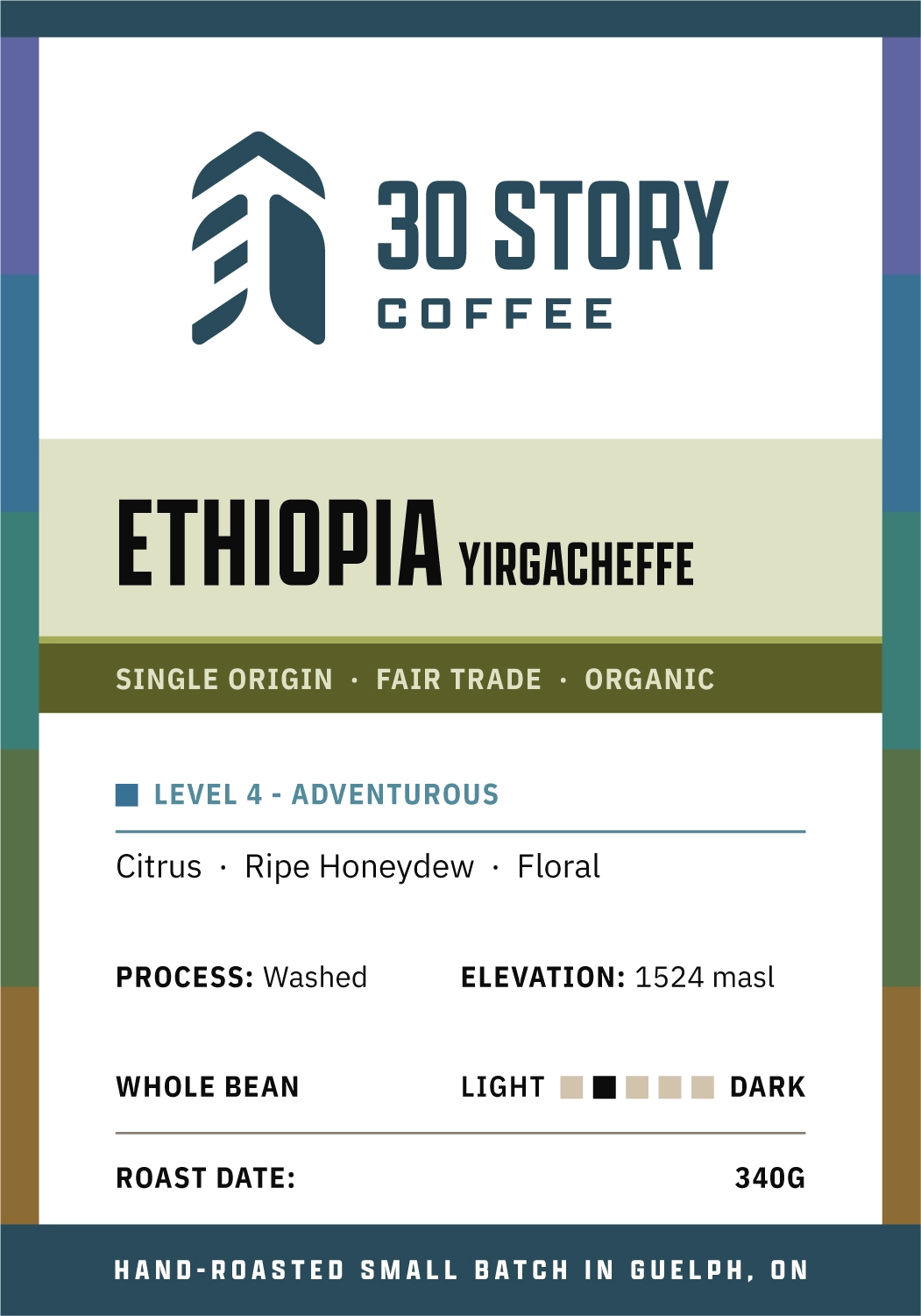
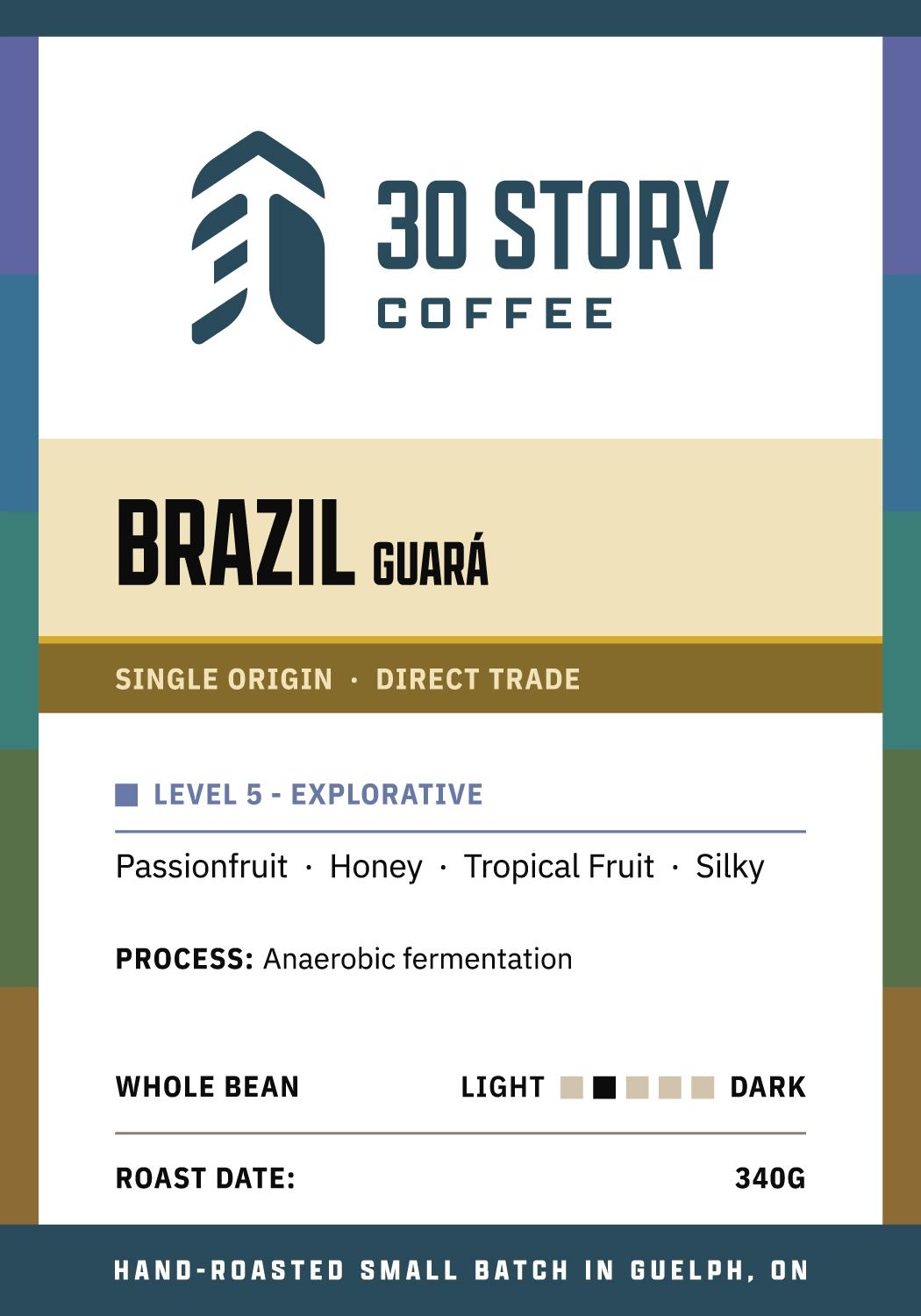
Custom printed bags were not financially realistic, so the budget set the format: a stock black pouch, one white label size, short runs, and hand-stamped dates.
The design also needed to accommodate the core roasts plus rotating single origins, with different data per product, without looking inconsistent or temporary.
Each roast gets a unique accent colour (plus tint and shade), used on the bag, in photography, and any product specific UI or design elements. The brand remains neutral to support that.
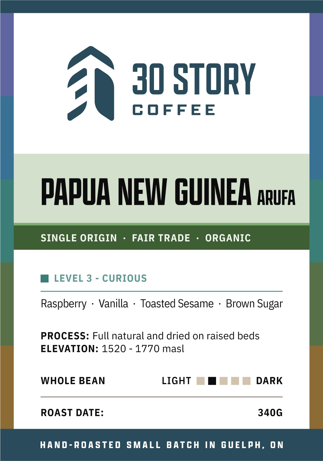
LOGO LOCK-UP
“Who roasted this?”
roast colour
The fastest visual distinction between coffees.
name and origin
“Where is this from?”
sourcing
“Is it fair trade? Organic?”
level
“Will this be too weird for me?”
tasting notes
“What does it taste like?”
process & elevation
“Why does it taste like that?”
Included when meaningful to the flavour.
grind & roast
“Dark roast? Can I get it ground?”
date & weight
“How fresh is it?”
online
an interface to guide
A conventional product card cannot compare roasts sufficiently enough to make a decision.
If every comparison means opening a product page and going back, that’s too much friction.
The product cards had to do the filtering.
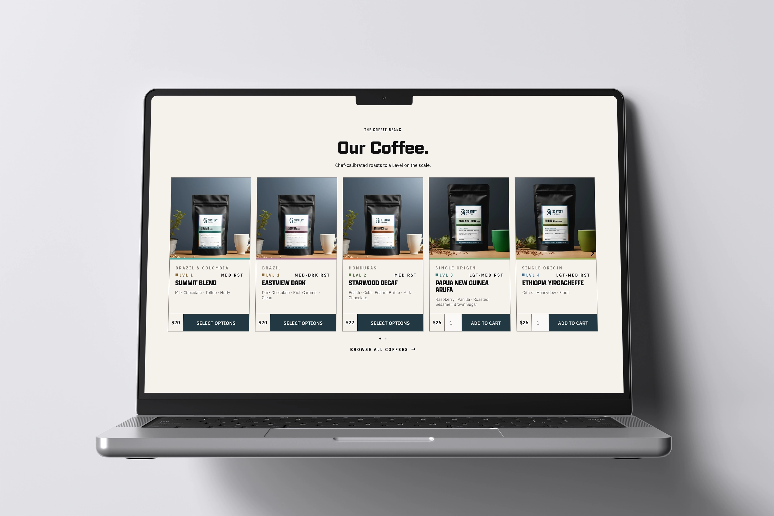
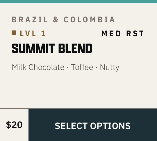
roast colour band
ORIGIN
level & roast
name
tasting notes
price
I used custom PHP and CSS to pull product attributes into the product cards and pages with a WooCommerce/Advanced Custom Fields/Square POS setup.
where it stands
the work is live
The early signals since launch come from market customer behaviour: customers are returning for roasts by name, making decisions based on level, and familiar-roast buyers are moving into single origins.
“Definitely get the Summit. Everybody will like it.”
“I normally get Summit, but the Guatemala is really good!”
“My dad likes trying new things, so I’ll get him the Brazil.”
With a bigger budget, I would buy custom-printed pouches and real documentary photography of our product and process. What I would keep is the system underneath, because now it can grow with the business.