Brand identity and packaging · 2026
30 Story Coffee
A coffee brand redesigned to grow beyond markets.
30 Story Coffee is a small-batch coffee business I co-founded with my partner. In 2026, I redesigned its identity for a stronger market presence, adaptable packaging and future online and wholesale growth.
- Business
- 30 Story Coffee, a small-batch coffee business in Guelph, Ontario
- Relationship
- Co-founded with my partner
- My work
- Brand strategy, identity, Level system, packaging, market signage
- Launched
- June 2026
A brand ready for its next chapter
Our original identity’s handmade character no longer reflected the more established, quality-focused business we wanted to present. With a new season of market signage planned, I developed an identity we could confidently build on.
Roasting starts as a pandemic hobby.
First identity, first sales.
First market season.
–
More seasons, increasing repeat demand.
Brand reassessment begins.
New identity and Level system launch.
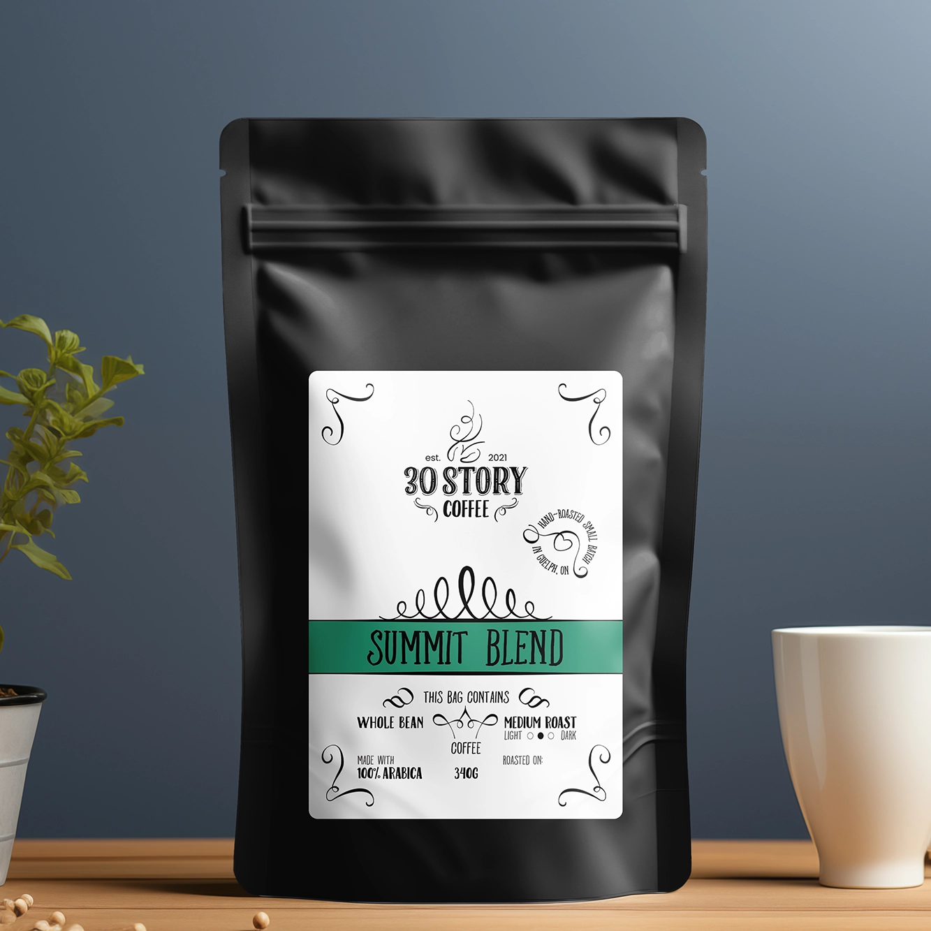
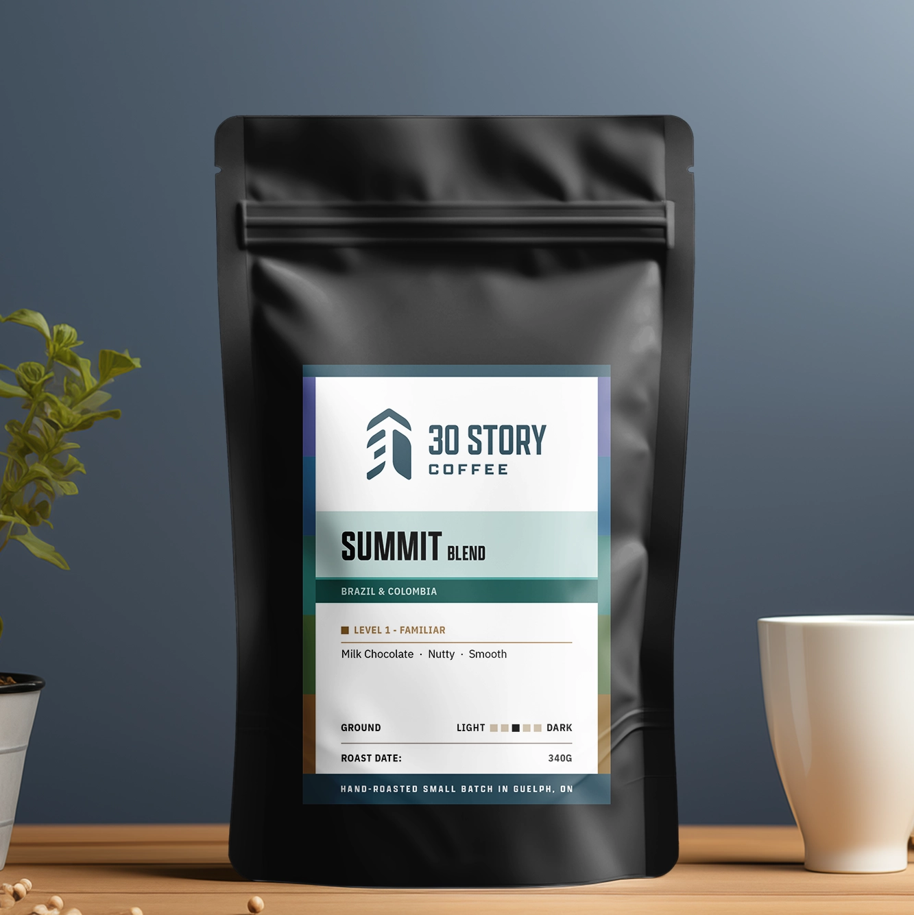
An identity built on elevation
The name 30 Story originated in a 30th-floor Toronto condo. Looking upward at high-rise buildings inspired the shape of the new mark, with its rounded outer forms and sharp inner corners informed by the primary typeface’s geometry.
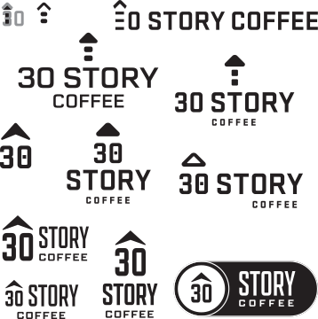


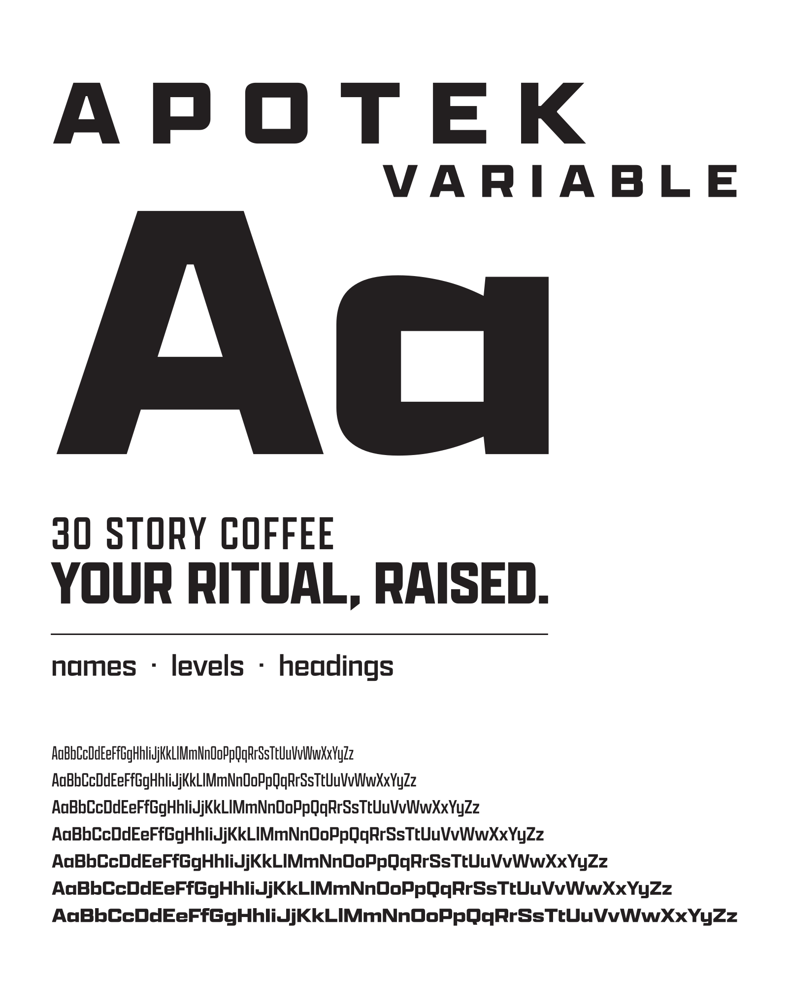
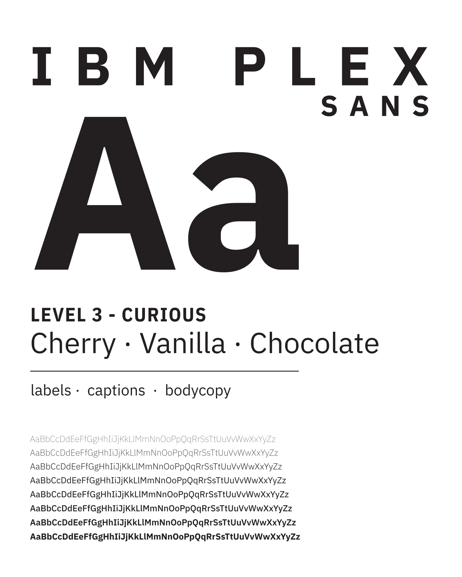
Multiple widths and weights provide versatility across display typography and information-dense labels.
Brand foundations
Restrained colours that give the roast colours the spotlight.
- Dark: #231F20, #191718, #0E0D0E
- Cream: #F4EBD9, #F8F1E6, #FEFAF5
- Mid neutrals: sand #D3C3AB, warm grey #877D74, mid #4A4540
- Blue anchors: #1F3741, #294B5A
Roast hues
Distinct colour families, each with coordinated tints and shades.
Summit Blend
Eastview Dark
Starwood Decaf
Papua New Guinea Arufa
Guatemala Huehuetenango
Ethiopia Yirgacheffe
Brazil Guará
Making coffee easier to explore
Questions and comments heard at the market table
- “I usually drink Timmies. What would I like?”
- “Do you have any dark roasts?”
- “I’m buying for someone who likes to try different things.”
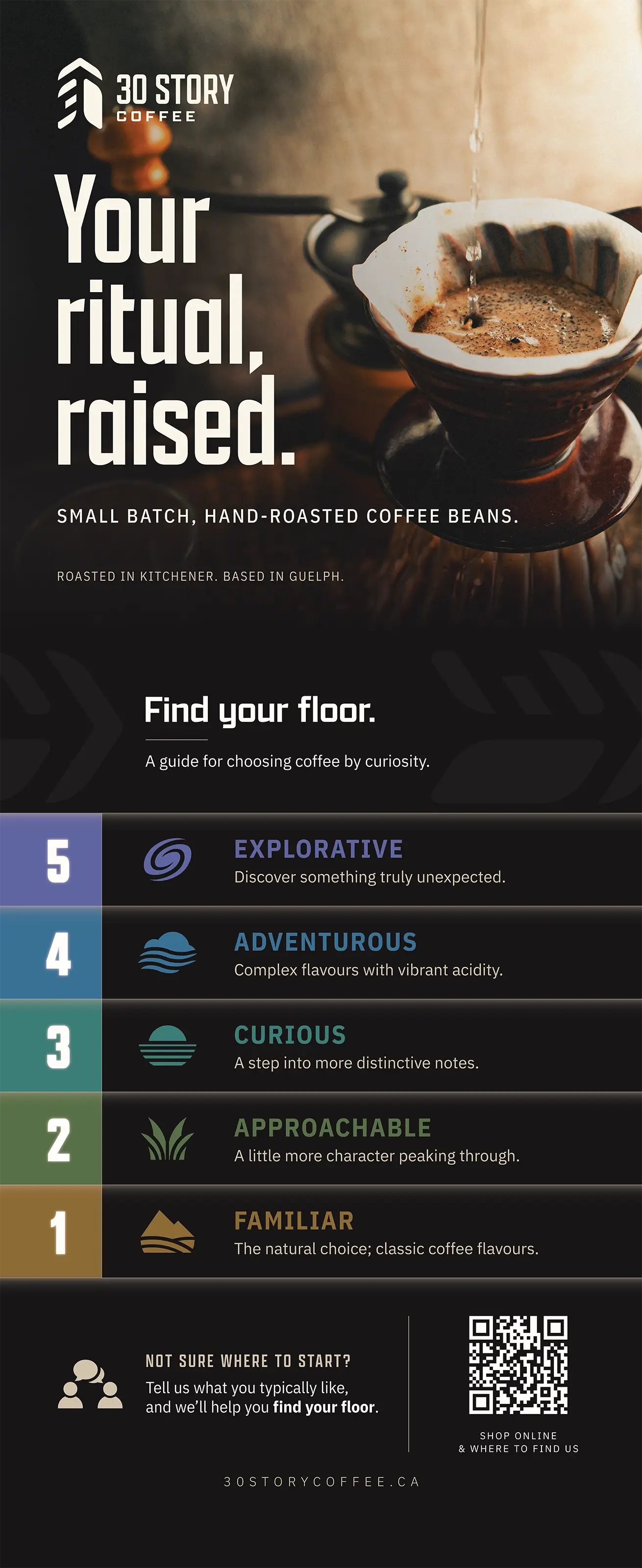
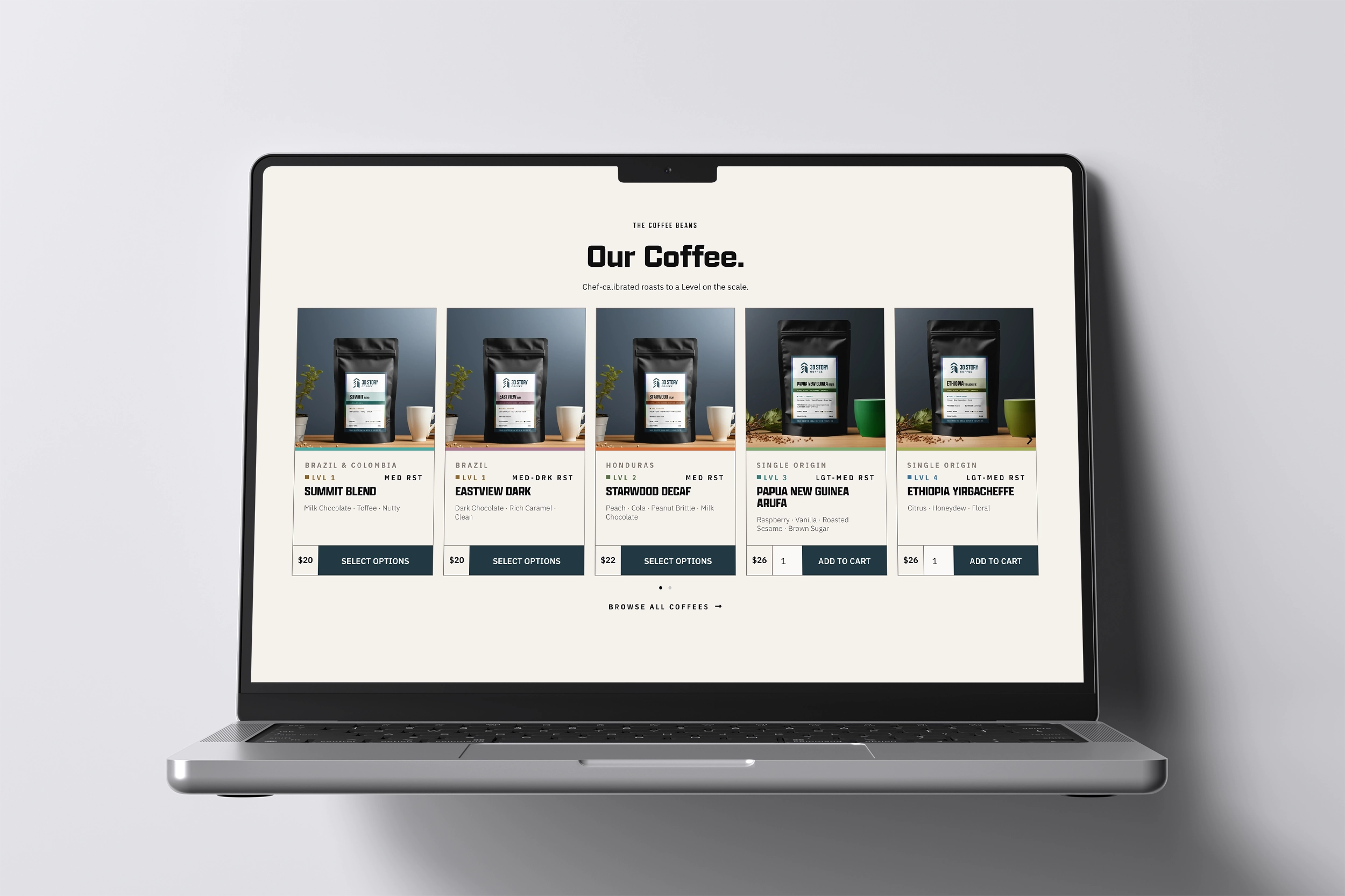
I developed a five-Level guide to help customers choose without a personal recommendation, particularly as we look toward online sales and potential retail distribution.

Ground
1 Familiar

Grass
2 Approachable

Horizon
3 Curious

Sky
4 Adventurous

Galaxy
5 Explorative
An indication of flavour familiarity and exploration, not coffee quality or roast darkness.
The coffee can be complex, but choosing should be simple.
Designed for changing coffees
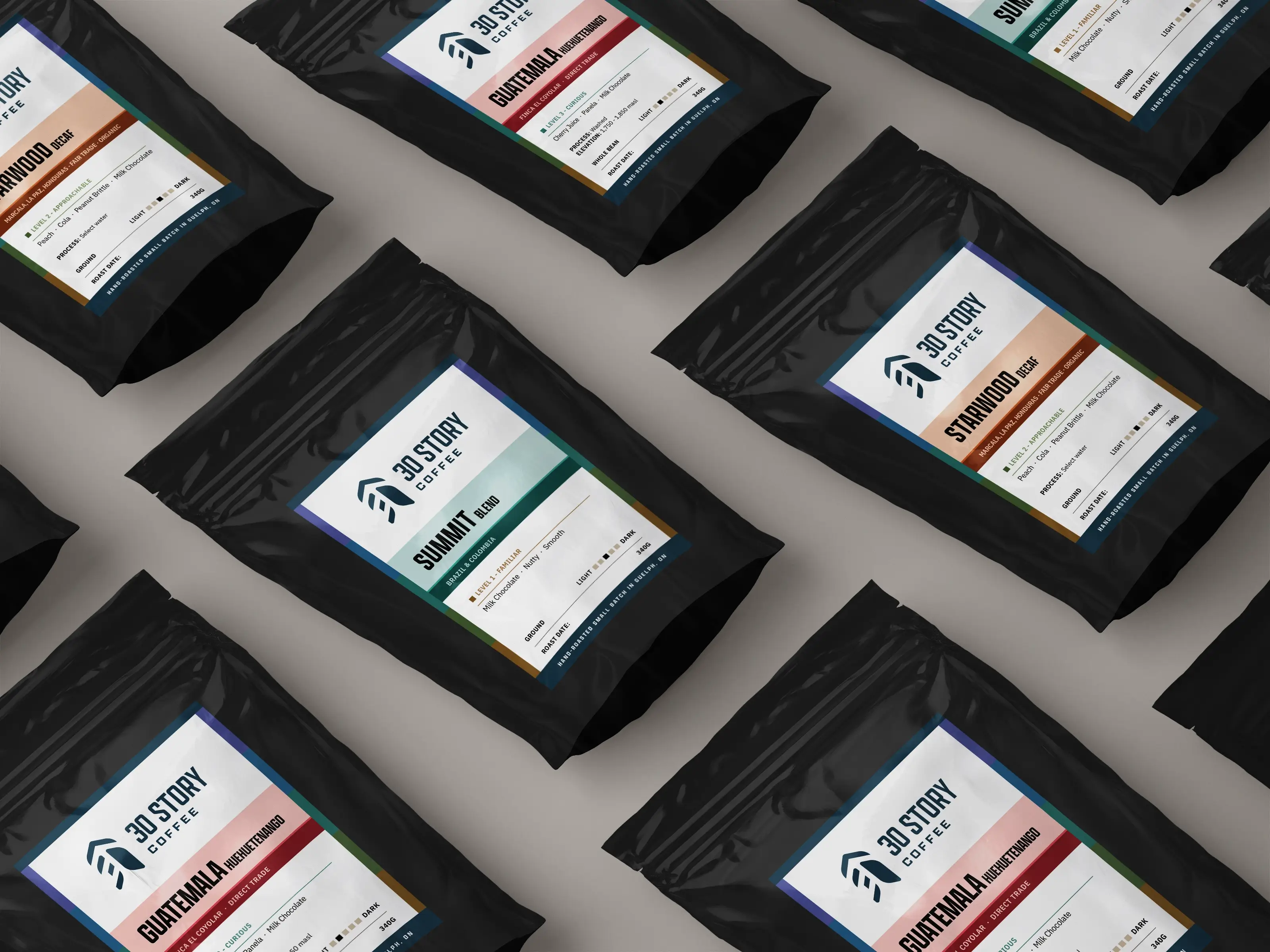
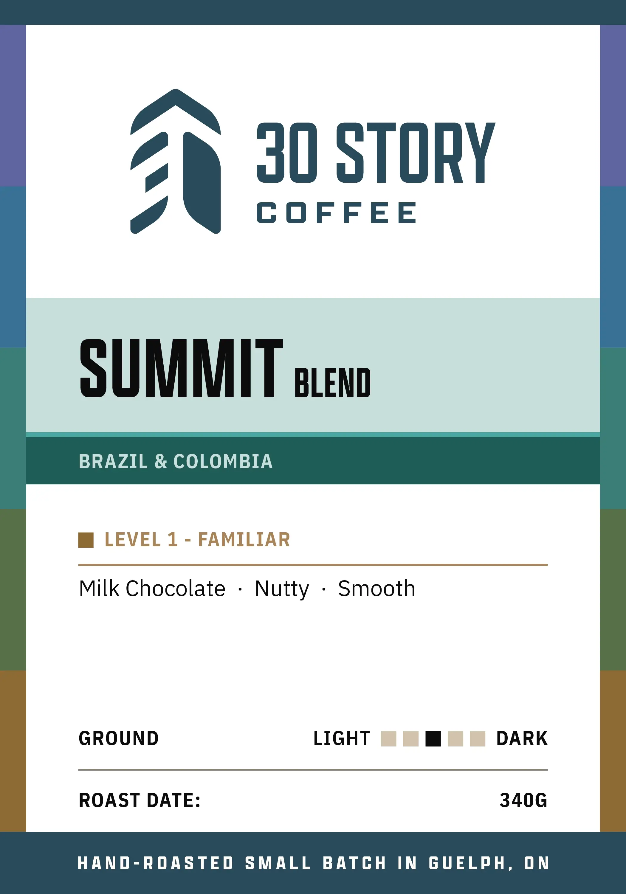
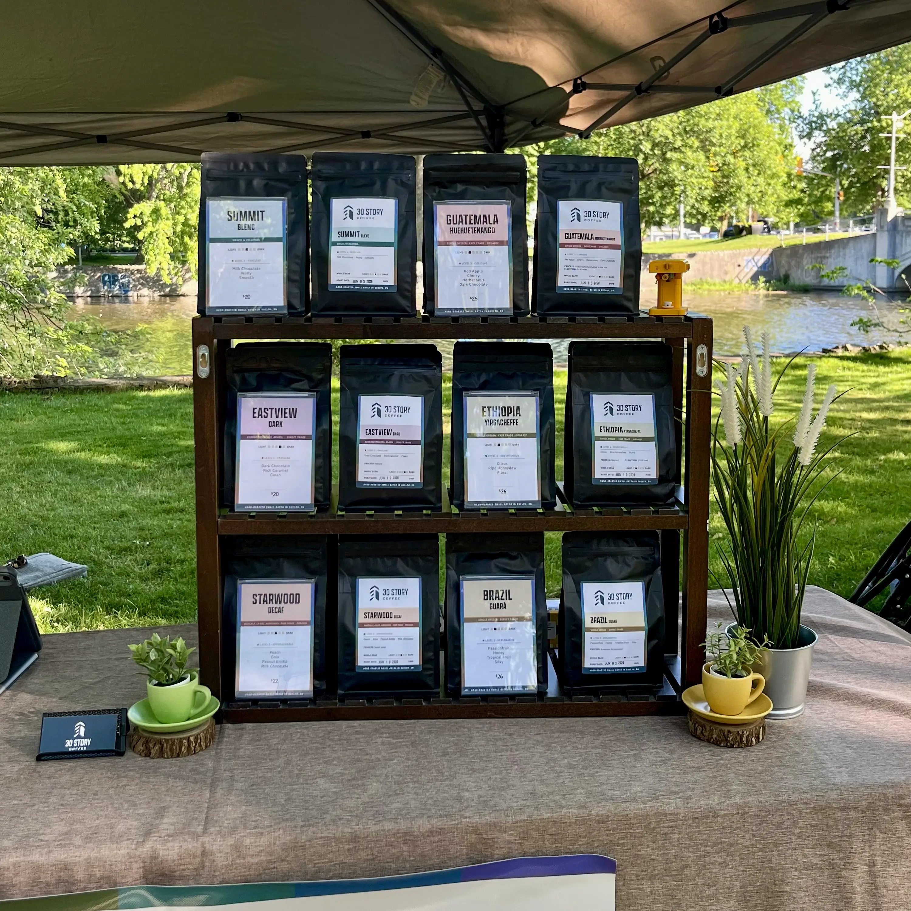
Rotating single-origin coffees required a flexible layout that adapts to new product information without a new design.
Custom-printed bags weren’t financially practical at our scale, so the labels had to work within specific constraints.
Production constraints
- Stock black pouches
- One white label size
- Short in-house print runs
- Hand-stamped roast dates
Summit Blend
Eastview Dark
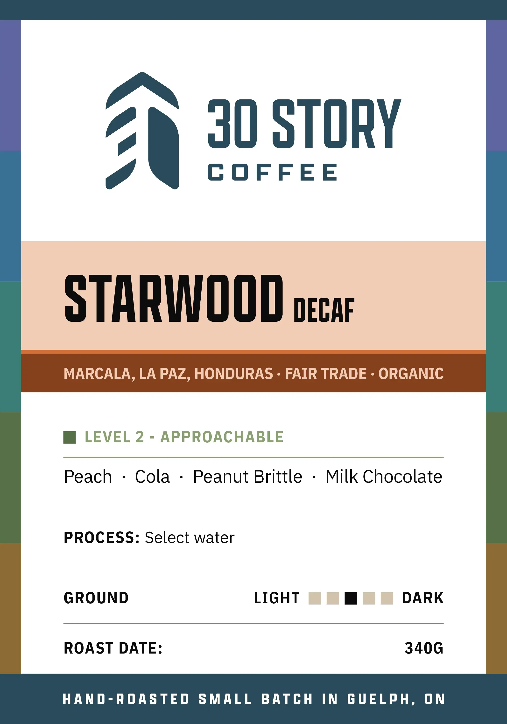
Starwood Decaf
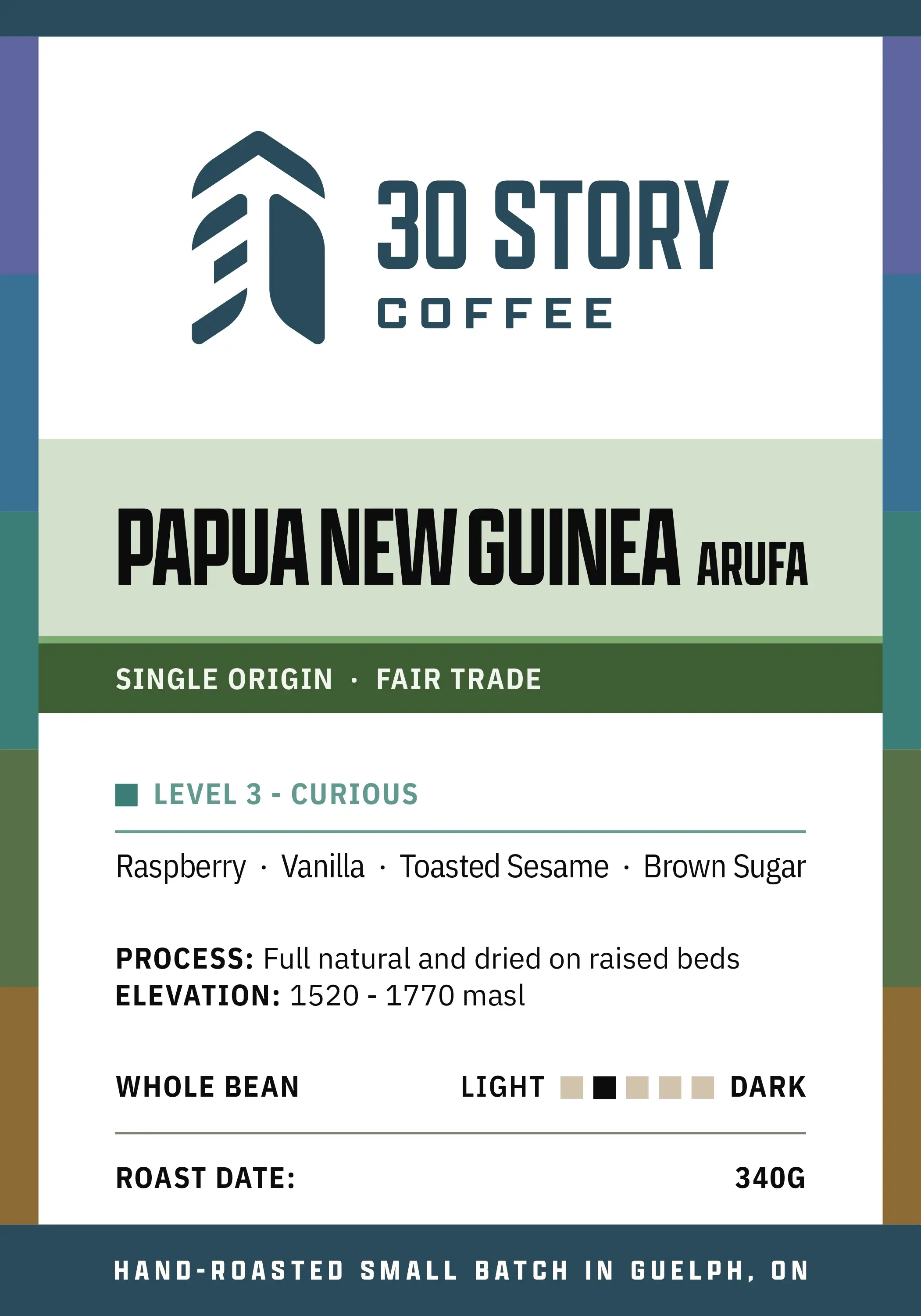
Papua New Guinea Arufa
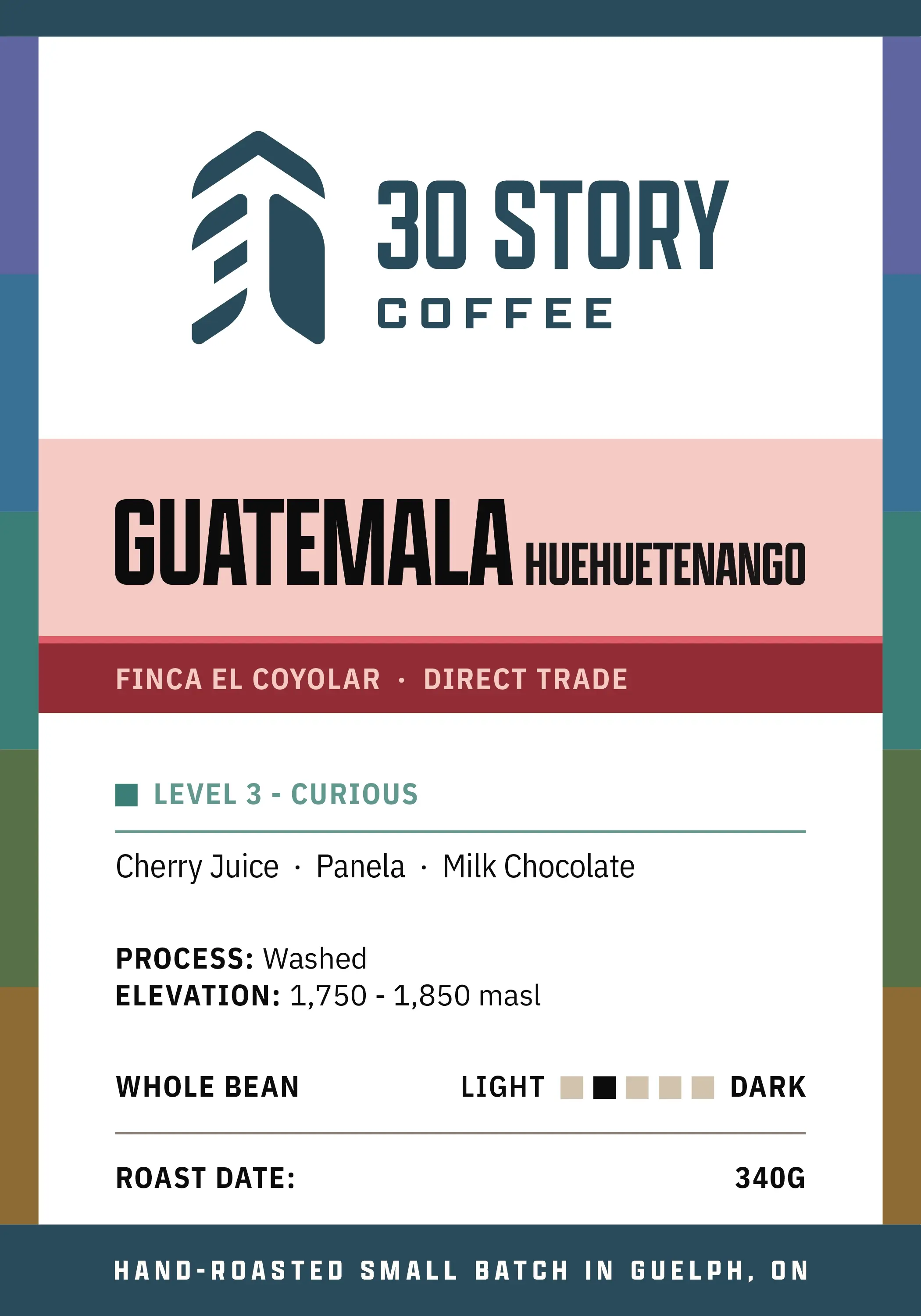
Guatemala Huehuetenango
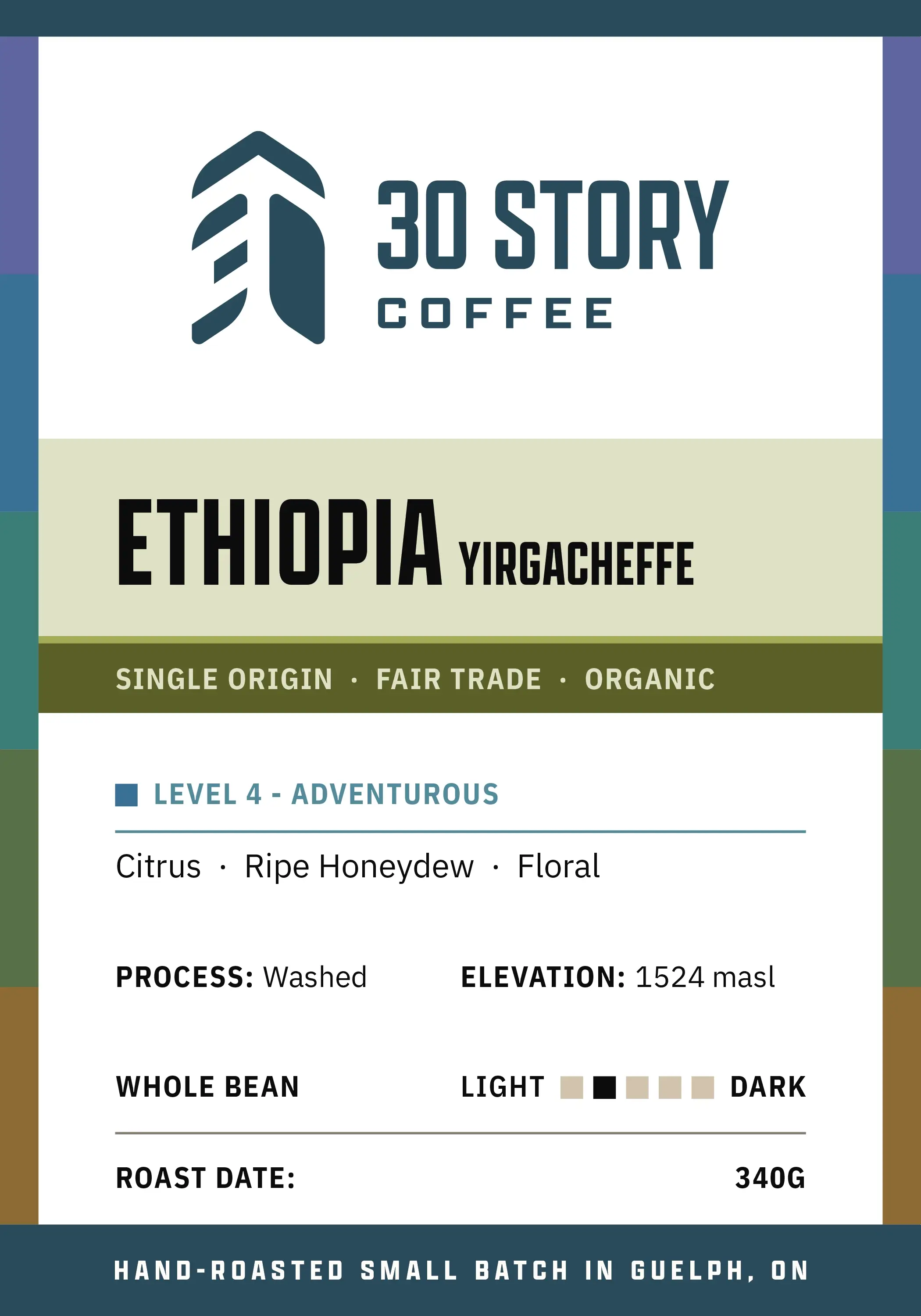
Ethiopia Yirgacheffe
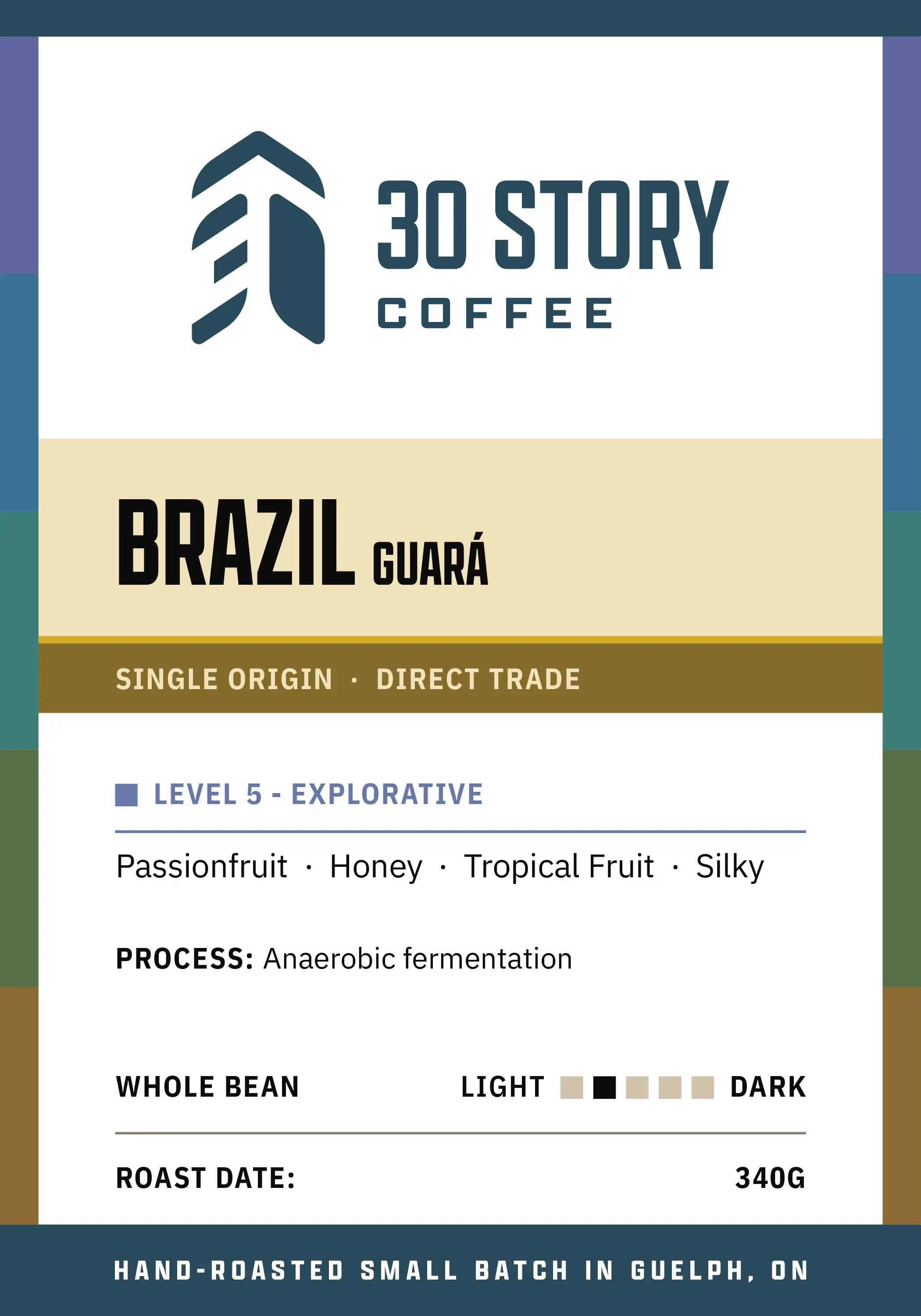
Brazil Guará
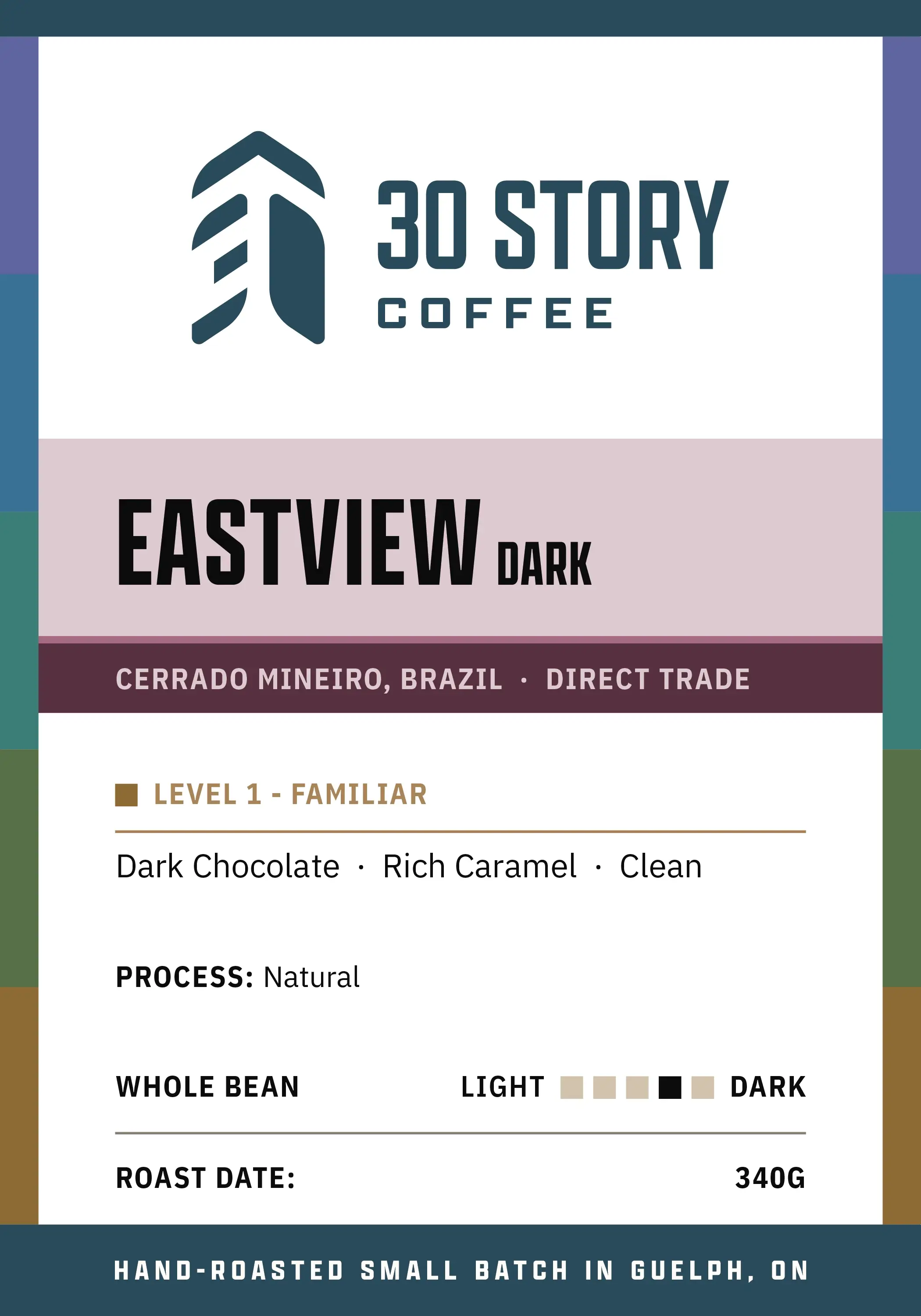
A consistent layout accommodates any roast while differentiating through colour.
Level and tasting notes
Grouped to help customers anticipate the flavour experience, separate from the roast’s darkness.
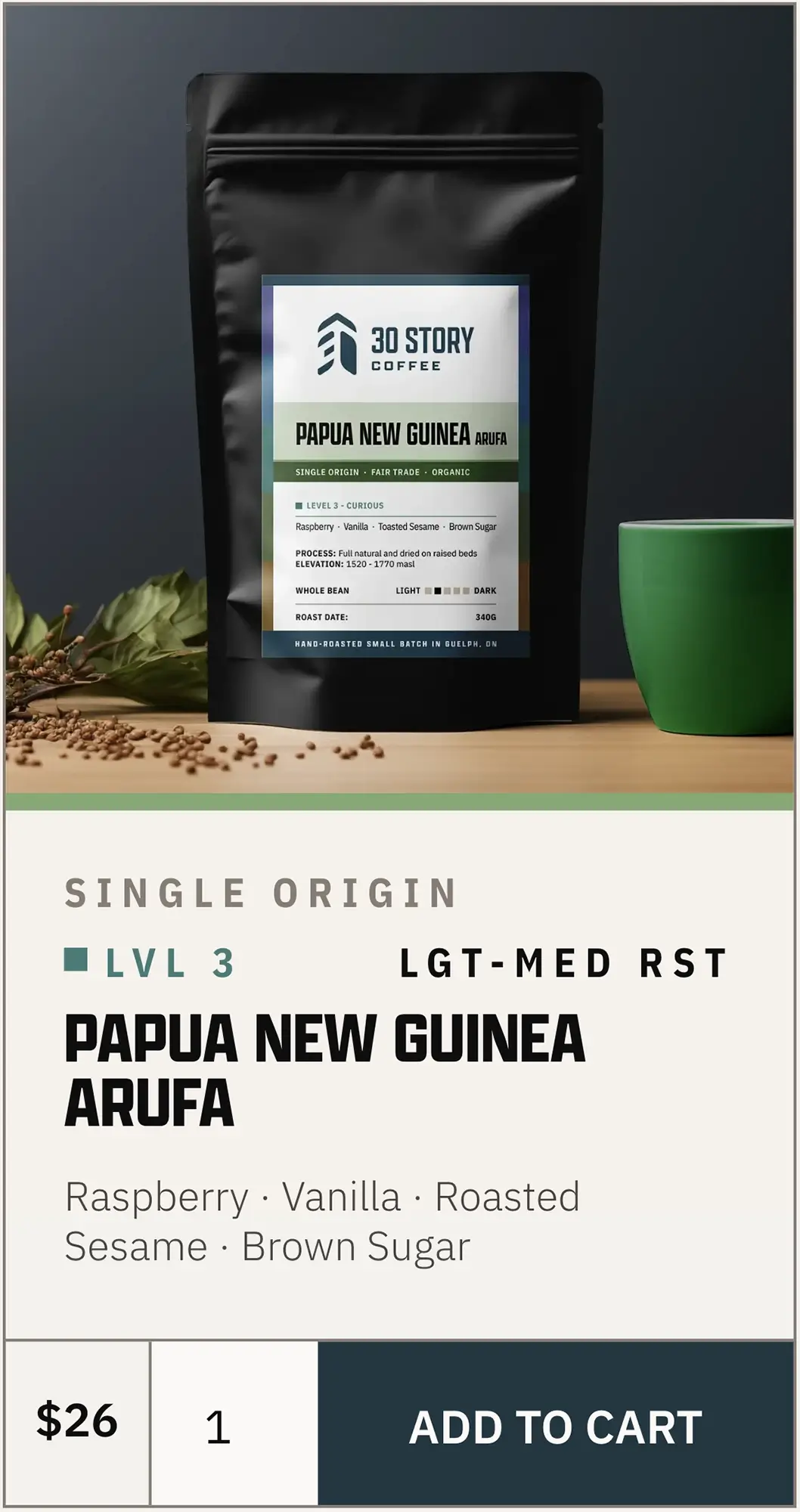
Process and elevation
Included when relevant to understanding the coffee’s flavour, not automatically on every label.
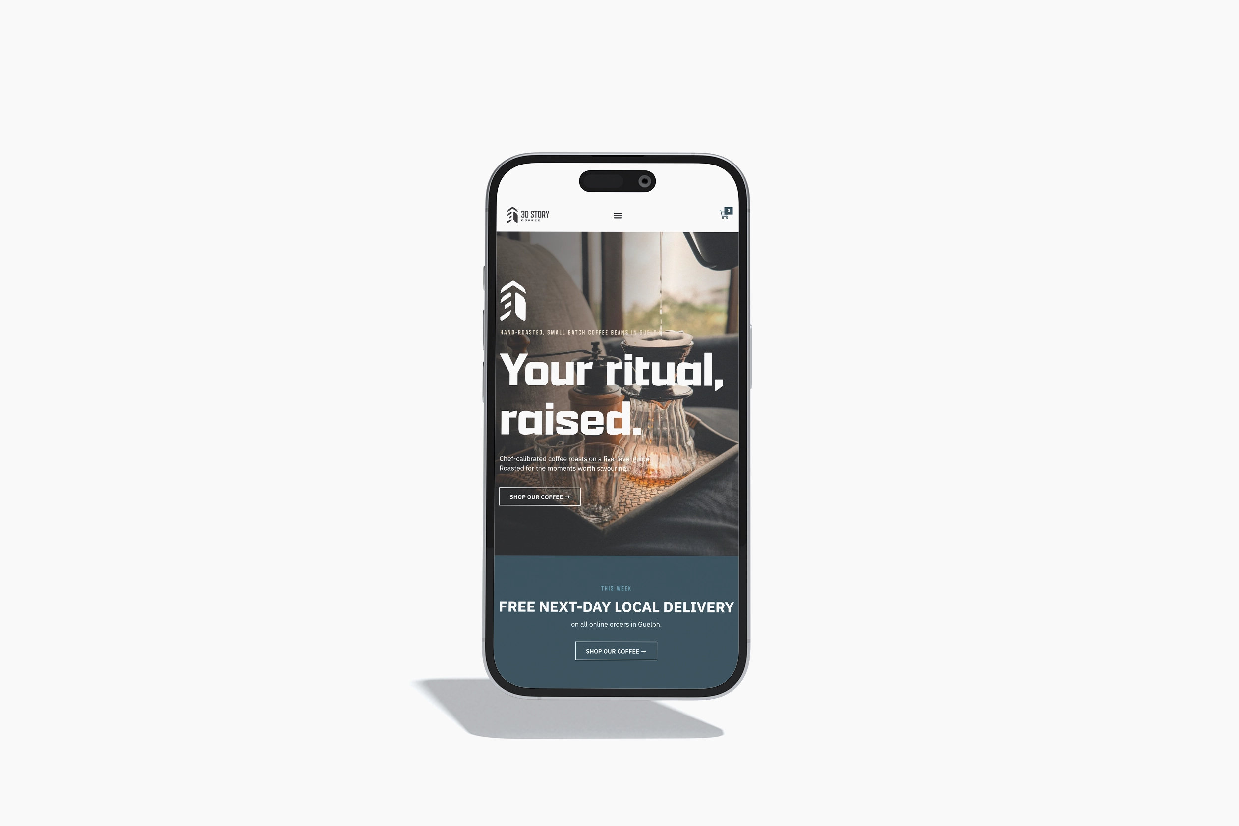
Looking ahead
A customer shopping for his father gravitated toward our more exploratory Levels after we explained the system — an encouraging early example of how it can help people choose.
The identity is already supporting our changing coffee lineup, with room for new products and applications as the business develops.